 In another instalment in the sporadic series “Views of Kapiti”, this was a shot I took from the housing estate I live in, while out walking my baby daughter (to sleep).
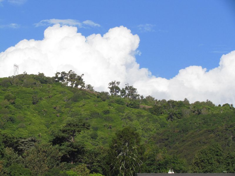
I found the vivid “tri-colour” effect of this shot pleasing: the green of the regenerating bush of the Paraparaumu Scenic Reserve [click here to view map]; the white of the cumulonimbus cloud against the blue of the sky.
Given the recent resurgence in discussion about a new flag for New Zealand, it occurred to me that these colours/motifs would be a good basis for a flag design…
See also: Views of Kapiti 3: Wharemauku Stream; Views of Kapiti 4: Maungakotukutuku Valley; Views of Kapiti 5: Paraparaumu Scenic Reserve; Views of Kapiti 6 – Reikorangi farmscape; Views of Kapiti 7: Morning mist over Hemi Matenga; Views of Kapiti 8: the kahikatea of Ngatiawa


I agree about the colours for a flag. After all, what does red have to do with us? In fact, if I remember correctly these colours were used in a recent suggested design.
Yes, these are the most often occurring colours in the natural environment. I think they would resonate very well in a flag design.
Yes there is much more of significance in the green white and blue for NZ than the black and white (silver?) being suggested with the ‘silver fern’.